Company Website
Module K: Turning Project Credibility Into an Owned Proof Channel
Jul 2, 2026 · 8 min read
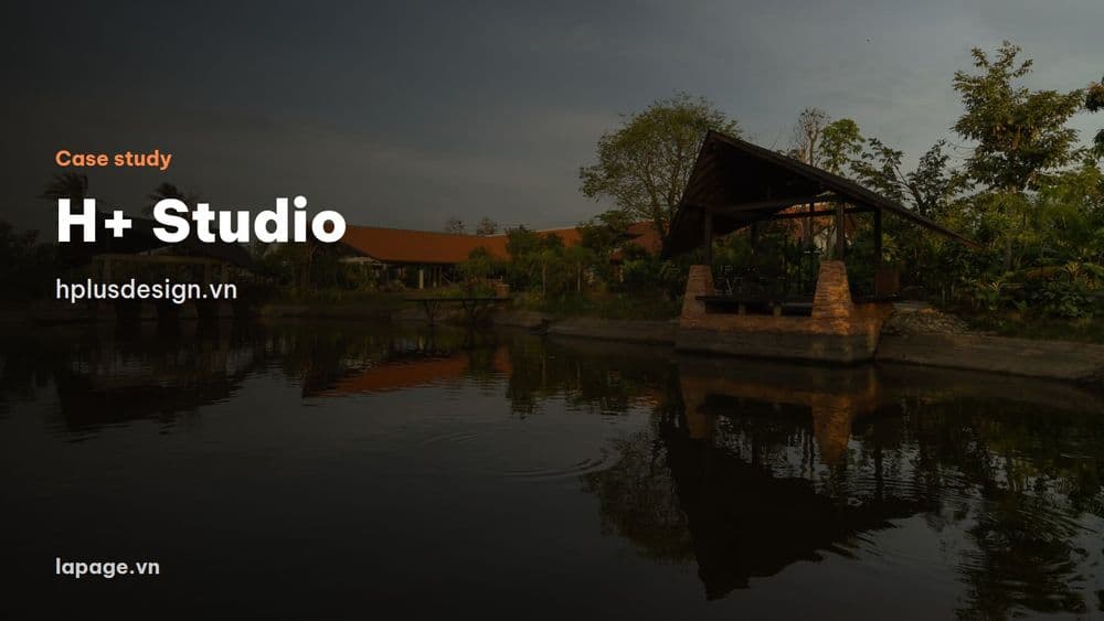
H+ Studio in Vung Tau needed a project portfolio on its own domain. This article walks through each part of the website, why it was built that way, and a self-check table for architecture, interior and construction firms.
An architecture studio does not win clients with an introduction. It wins them with the belief that it can deliver their building. H+ Studio in Vung Tau needed a website that does exactly that: show the work first, then bring in enquiries with enough detail to discuss. This is how LaPage built it, what each part does, and what you can apply to your own firm.
Watch the 66-second tour: video of the H+ Studio website (in Vietnamese).
See it live at hplusdesign.vn. All project photos in this article belong to H+ Studio.
H+ is a design studio founded in 2024 in Vung Tau, working on homes and on commercial projects such as hotels and cafes. It needed a place to act as a portfolio and present each project, on its own domain, in both Vietnamese and English.
This is a familiar problem in architecture, interiors and construction. Good work sits scattered across Facebook and Instagram, where older posts disappear quickly. People wanting to look again have to scroll for ages, and then often ask something vague like "how much for a house?"
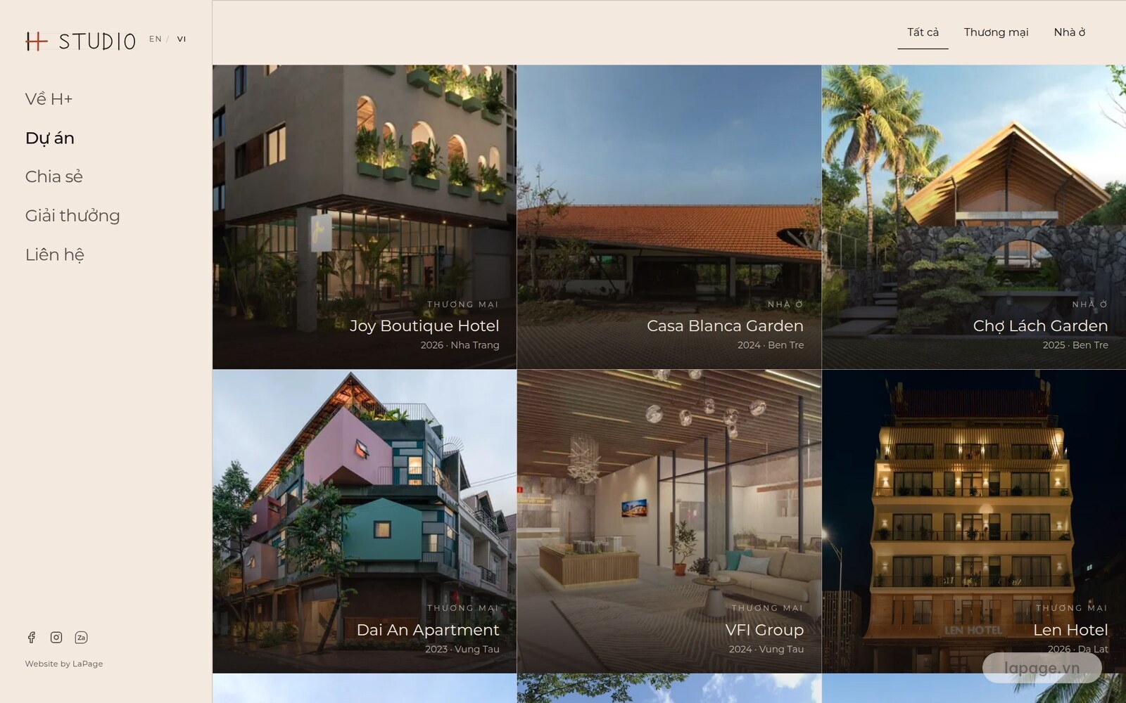
There is no long introduction. Visitors land on a full-screen project grid, with each tile showing the type, name, year and location. The side menu stays in place so people can move on at any time.
Why: in this field, project photos are the strongest proof. Put them first and people see straight away whether the studio's style suits them.
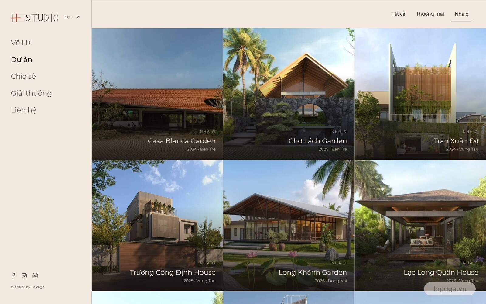
Someone building a home and someone opening a hotel care about different things. The All, Commercial and Residential filter gets each person to the right work in one tap.
Why: seeing a project like their own convinces people faster than a long list.
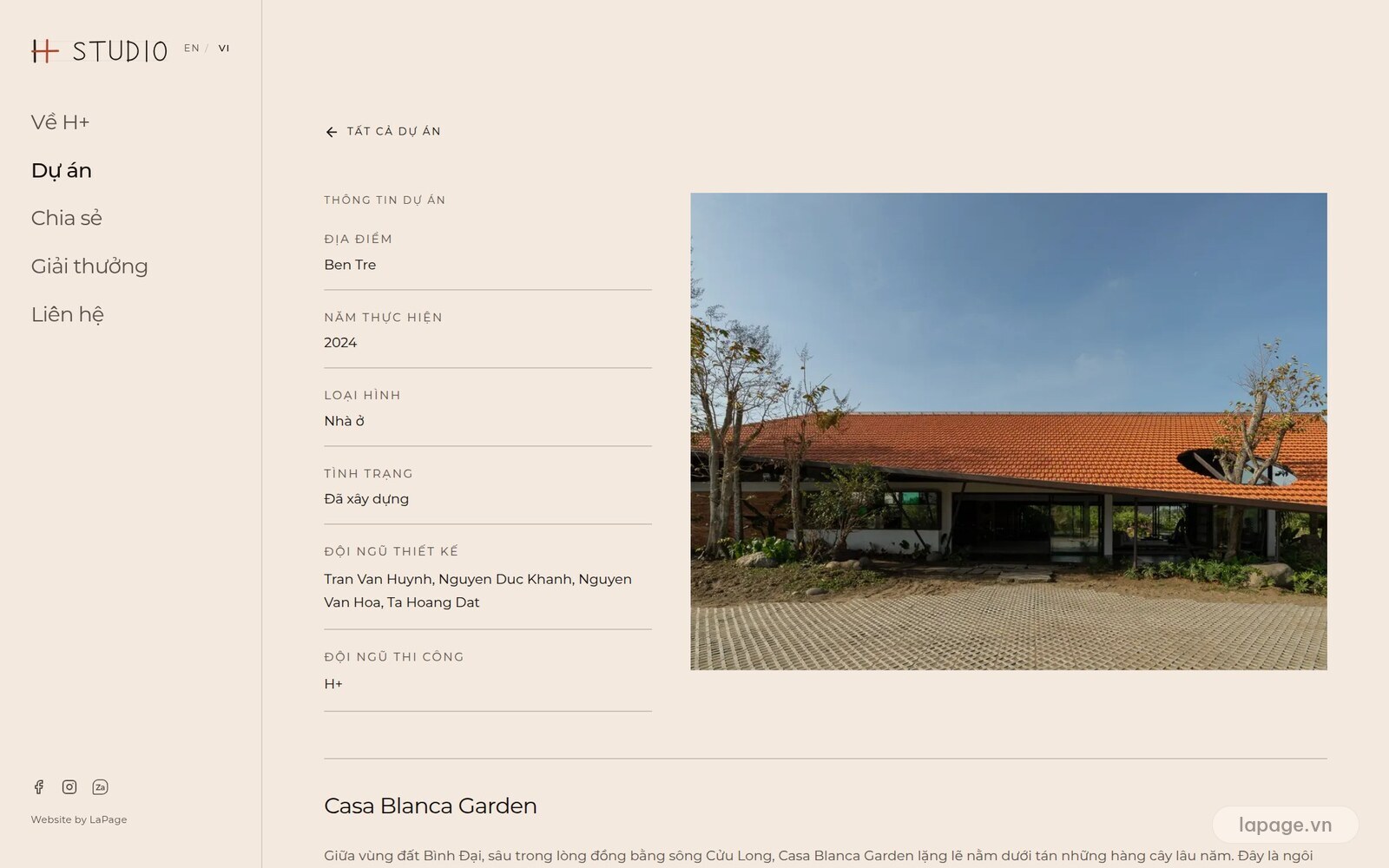
Each project has its facts in one block: location, year, type, status, and the design and construction teams. Below that comes the story of the building, then the photo set.
Why: the facts answer practical questions. The story shows how the studio thinks, such as how Casa Blanca Garden was designed to work with the Mekong Delta climate rather than fight it. A photo cannot say all of that.
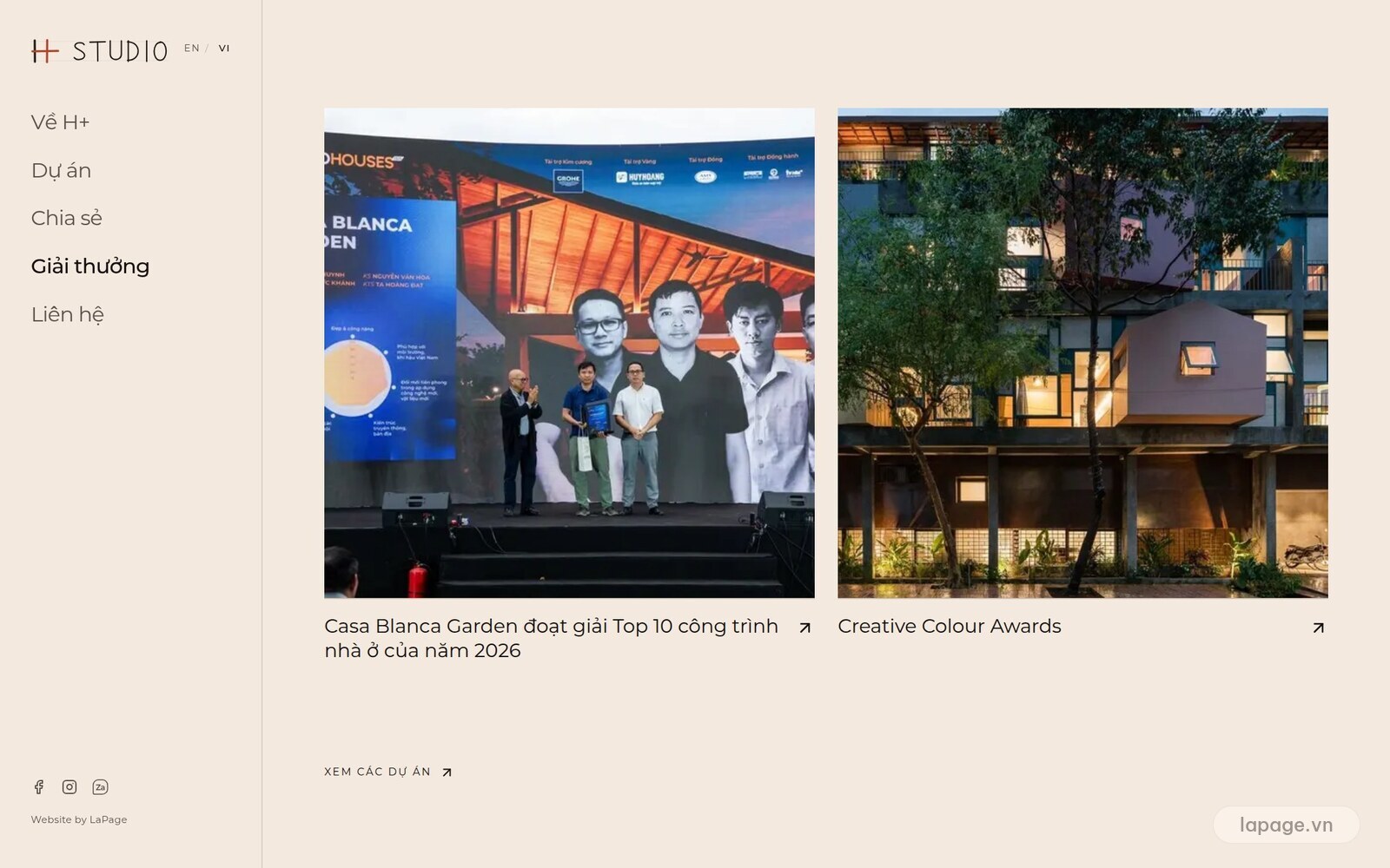
Casa Blanca Garden won a Top 10 Houses of the Year 2026 award. Instead of letting that news fade in a post, the site gives awards their own page and mentions it on the project page.
Why: people weighing a decision want a reason to trust you. That proof should be easy to find, and still be there years later.
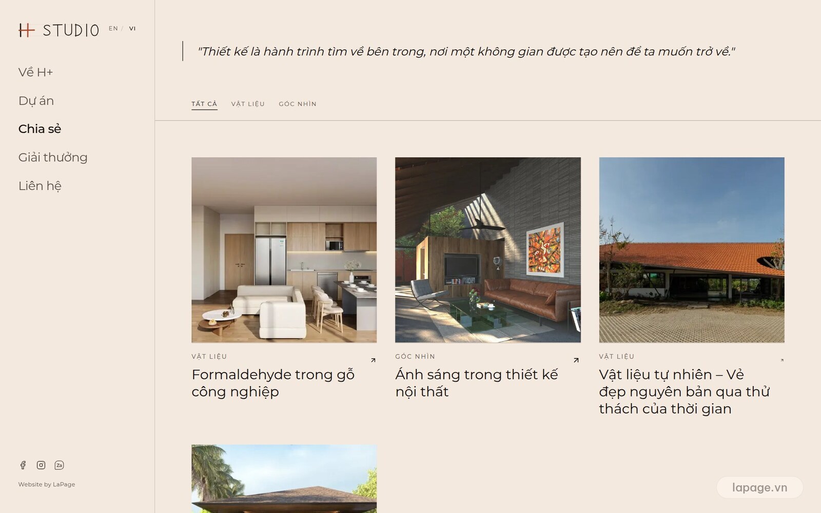
H+ writes about materials, light and proportion, such as formaldehyde in engineered wood and light in interior design, filtered by topic.
Why: people about to build usually research for a long time before calling. Articles help them meet the studio sooner and give Google more content to find.
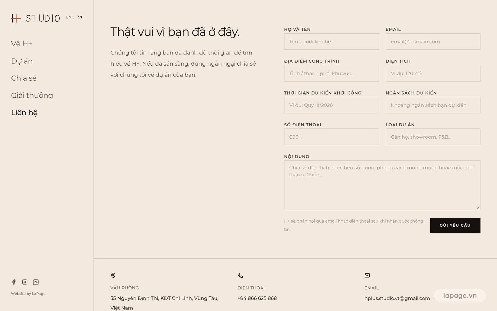
This is the part most worth copying. Besides name, email and phone, the form asks for the site location, floor area, expected start date, expected budget and project type.
Why: the studio knows where the project is, how big it is and how urgent it is before calling back. The first call starts further along, and it is clear who to prioritise.
A longer form can put some people off, so this is a real trade-off. For high-value services such as design and construction, people who have looked through the work are usually willing to answer a few questions. If few people submit, make some fields optional.
The whole site runs in Vietnamese and English, switched with one button. On a phone, the grid becomes a run of large photos that are still easy to see. The studio updates its own content and images in the admin system.
If you work in architecture, interiors or construction, check your own website:
| Question | Good when |
|---|---|
| Do visitors see the work on the first screen? | Project photos appear straight away |
| Can they filter to their kind of project? | There is a simple filter by type |
| Does each project have facts and a story? | Location, year, team and approach are covered |
| Do awards and press have a home? | There is a page that is easy to find |
| Is the first enquiry enough to discuss? | You learn location, area, timing and budget |
| Does the portfolio live on your domain? | Yes, not only on social media |
The site has only just been handed over, so there is not enough data yet to report traffic or enquiries, and this article will not guess. What is already true: H+ Studio has a project portfolio on its own domain that it can update, in two languages, with a clear path for enquiries.
See website styles for architecture or message LaPage to talk about your company.
LaPage Digital documents real delivery work across architecture, automation, infrastructure, and operational systems.
Subscribe to our newsletter to receive technical insights and updates on best practices for web development and hosting infrastructure.