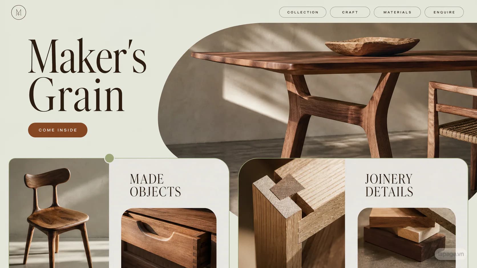
Maker's Grain website design direction
Maker's Grain independently combines raw catalog options into a organic humanist system for furniture makers, joinery studios, and crafted interiors; the result feels human, grounded, and sensorially rich.
Keep this direction in the URL while you compare the monthly website plans. It remains a starting point, not a fixed template.
What the Maker's Grain website direction is designed to do
Maker's Grain independently combines raw catalog options into a organic humanist system for furniture makers, joinery studios, and crafted interiors; the result feels human, grounded, and sensorially rich.
Use this direction as a business starting point
Its organic and human structure and distinctive character are best treated as a starting system for a Commerce or product catalogue website. LaPage can reshape the page hierarchy, content, and conversion path around the actual business.
- Woodworking
- Retail
- Architecture
- Product discovery and comparison
- Trust and professional credibility
- Commerce or product catalogue website
What LaPage customizes from this direction
The visual direction establishes a useful starting point. The commercial and operational details are designed around the client.
Related website directions
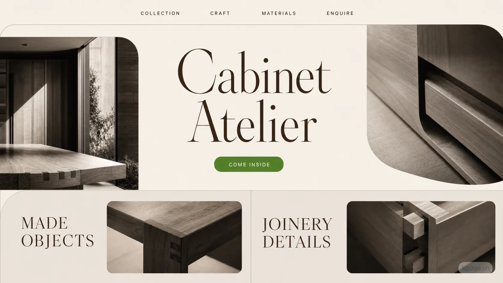
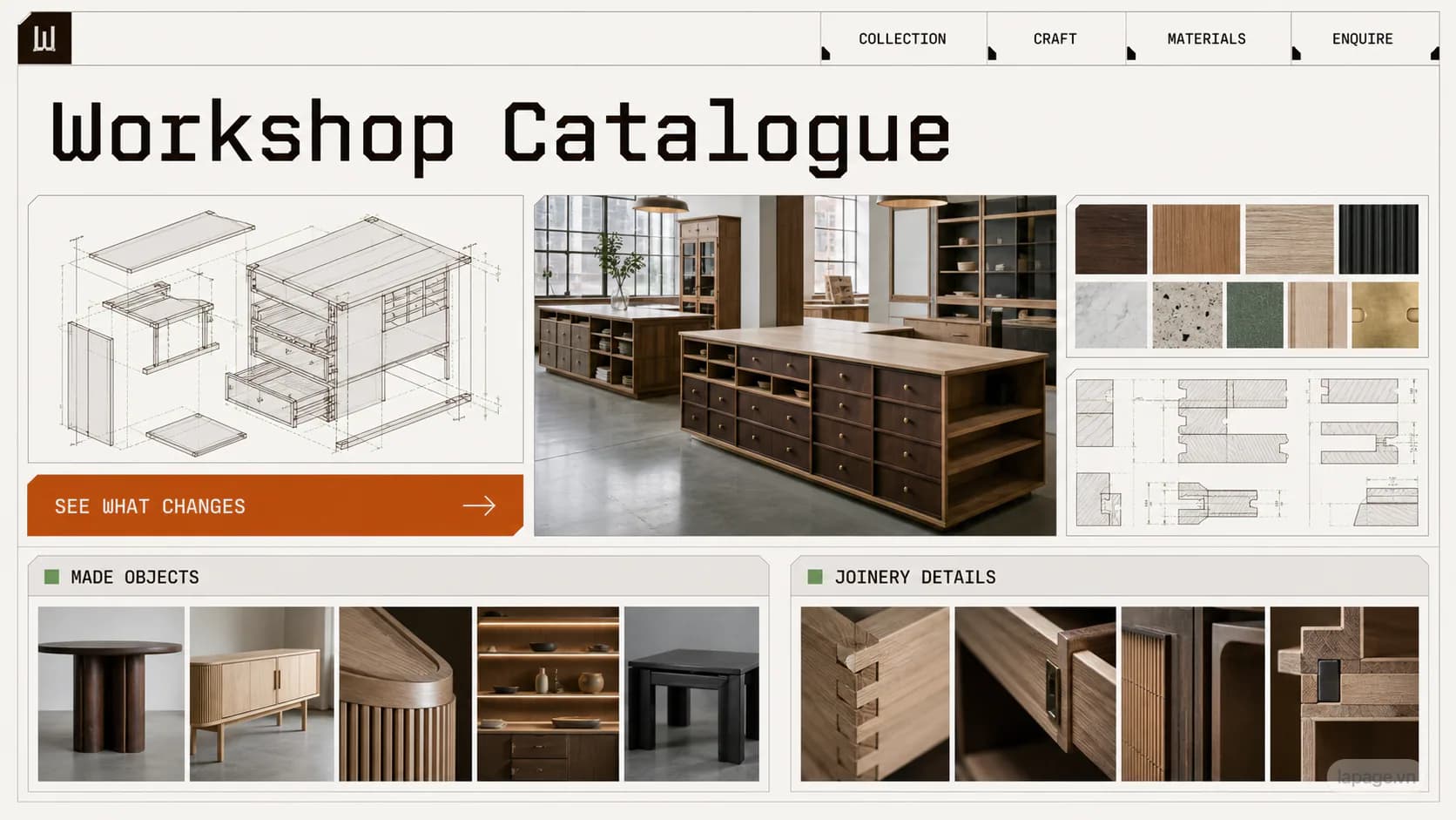
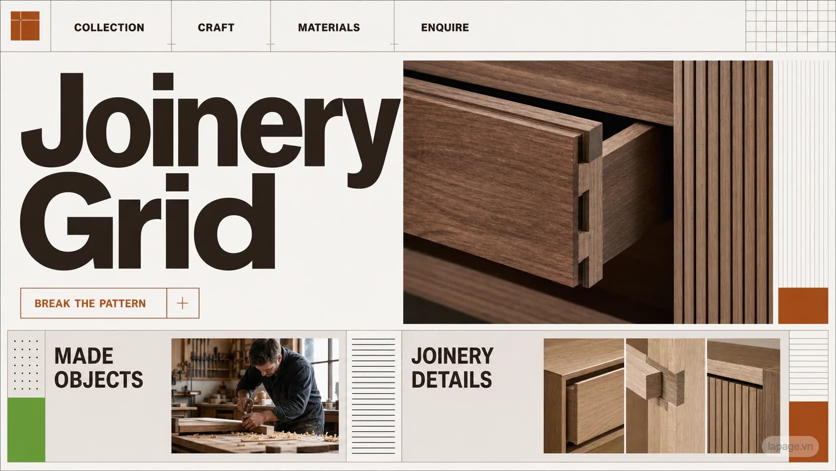
Compare directions with similar industry fit, layout structure, or visual personality before deciding.
Pair this direction with the right monthly plan
Compare the Landing Page, Company Website, and Ecommerce Website plans, or review more directions before contacting LaPage.