
ROI & Efficiency Optimization
11.11 on TikTok Shop: a 15-Day Prep Plan, and What Most Shops Forget After the Sale
Oct 27, 2026 · 11 min read
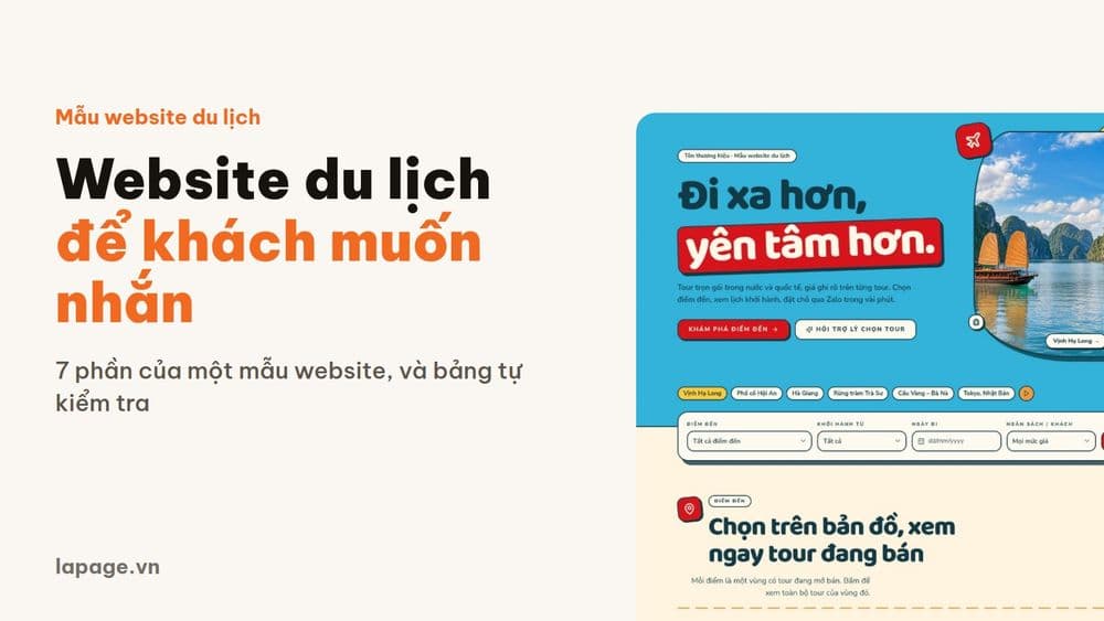
Visitors to a travel website want to know where to go, when it leaves, what it costs and who to message. This article walks through 7 parts of a tourism template, from a destination map and departure calendar to price estimates and Zalo booking, with a self-check table.

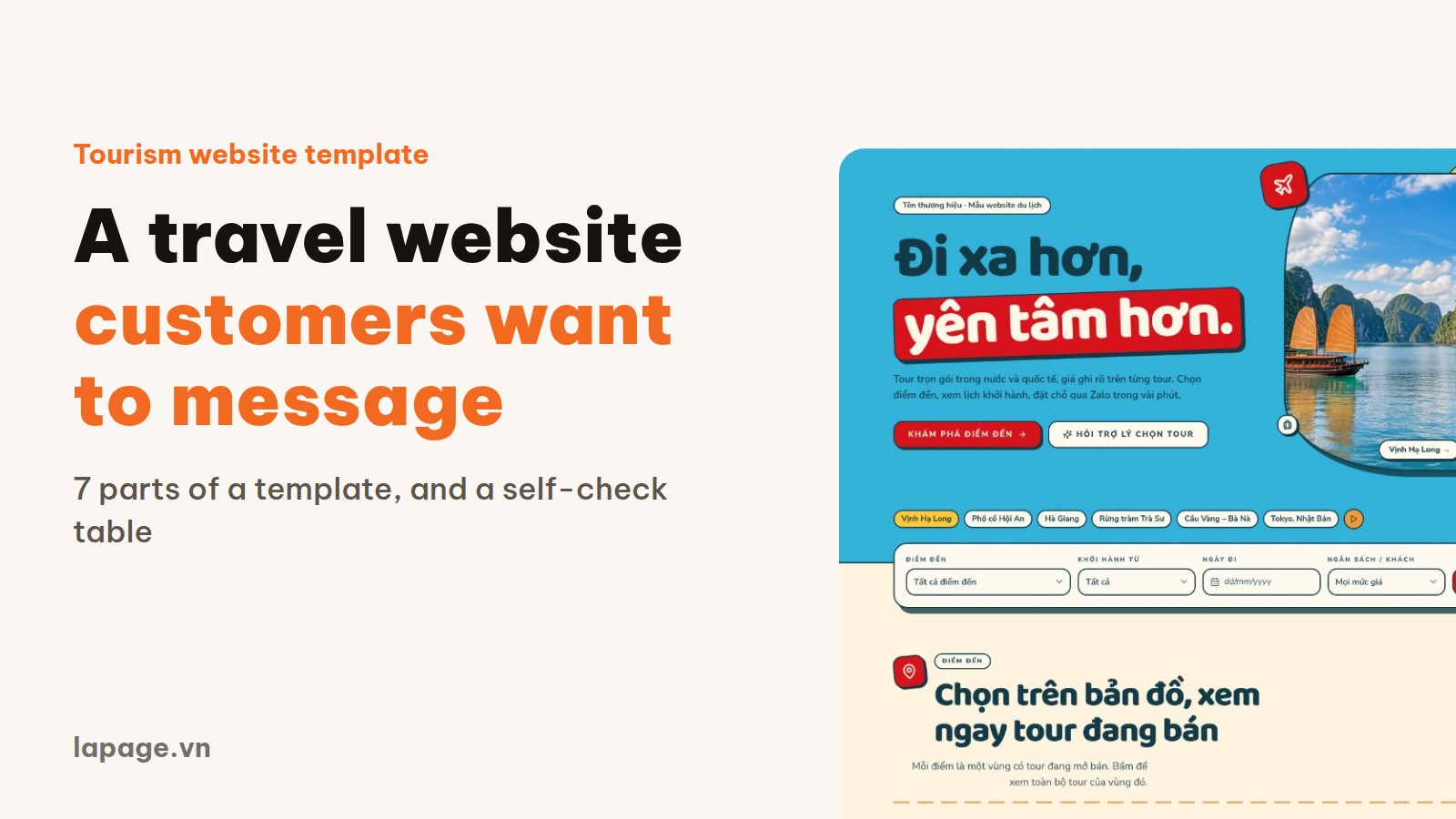
People landing on a travel website arrive with simple questions: where can I go, when does it leave, what will it cost my family, and who do I message to book? The sooner a site answers them, the easier it is to get that message. This article walks through a tourism website template built by LaPage, and the customer question each part answers.
The template suits tour operators, travel agencies and private-tour companies. Images and tour prices shown here are illustrative. A self-check table near the end lets you compare your own website straight away.
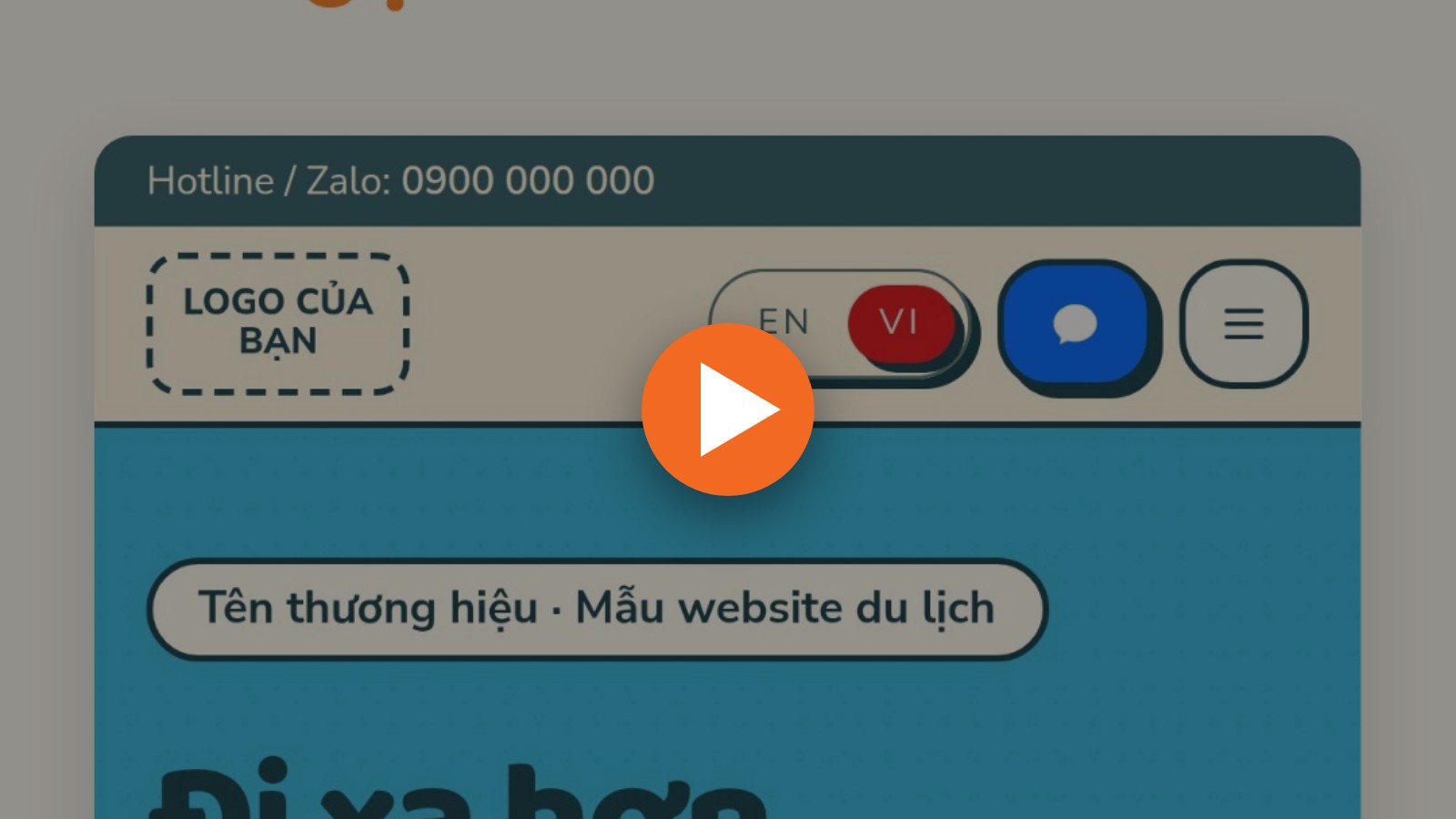
Watch the 1 minute 47 second tour (in Vietnamese), told through one customer's story.
A tour is a considered purchase. People compare destinations, dates and prices before they ask anything. Facebook and Zalo help people discover you, but posts move on fast, so it is hard for a customer to see everything you sell.
A website pulls it all together. If people have to guess, scroll for ages, or message you just to learn a price, your staff spend another reply on someone who may not be ready to buy.
So instead of asking whether the site looks nice, ask this: can a customer answer those four questions alone?
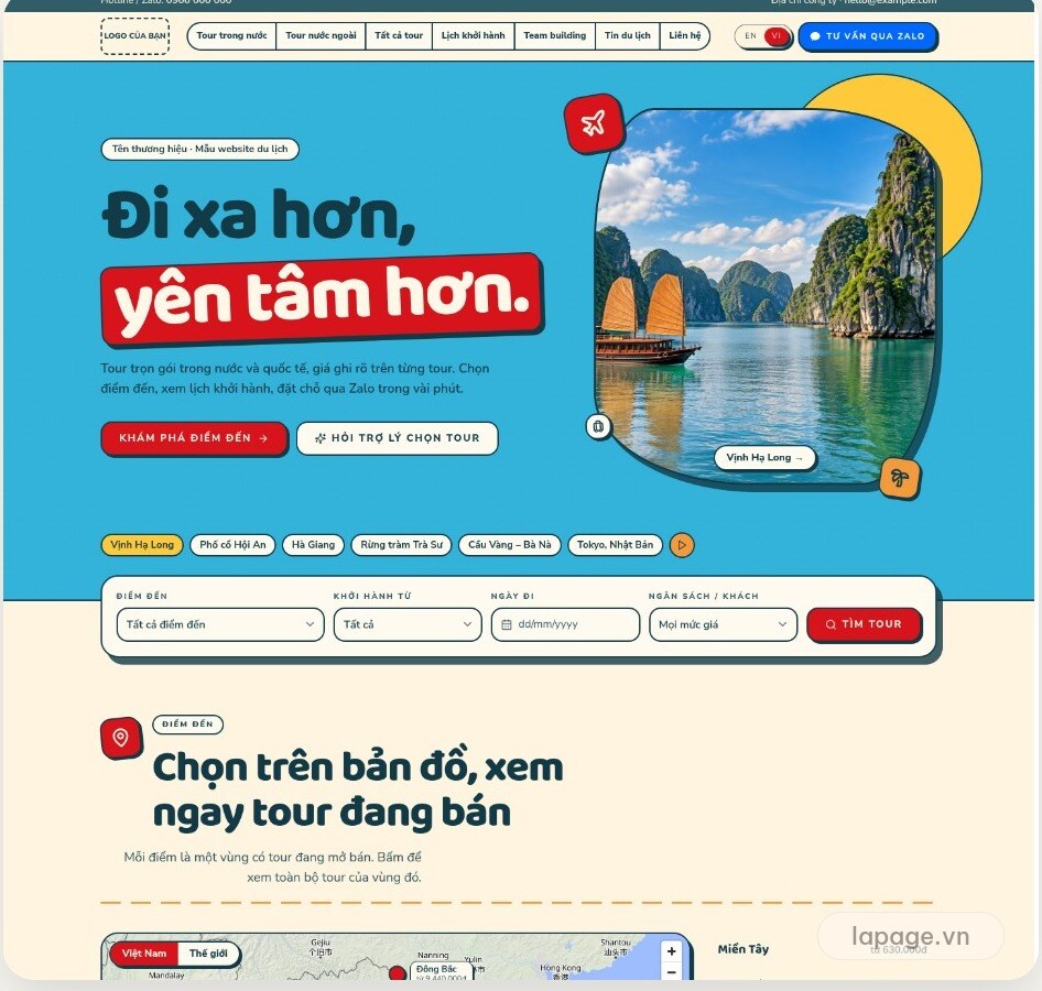
A new visitor has a few seconds to understand your business. The first screen has one short positioning line, a button to destinations and a tour search in plain view.
For your business: people who already know a tour or destination go straight there.
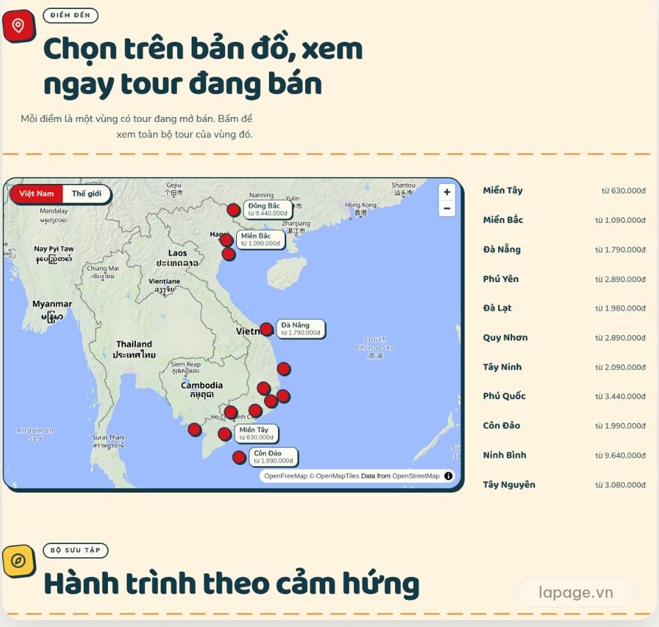
Many customers pick a region before they pick a tour. The map shows destinations with a "from" price for each, and one click shows that region's tours.
For your business: people see where you operate and filter by budget before they ask.
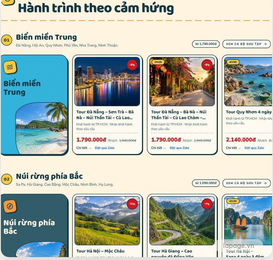
A big catalogue easily turns into an endless list. This template groups tours by theme, such as the central coast or the northern mountains, each with images, prices and a booking button.
For your business: the catalogue grows while the page stays tidy, and you can push the right collection each season.
"Any tours leaving next month?" is a question staff answer every day. The calendar lists tours by date, so customers can look it up before they message.
For your business: one less repeated question, and more staff time for people ready to book.
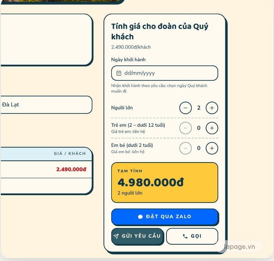
On a tour page, customers pick a date and the number of adults, children and infants. The estimate updates immediately.
For your business: people know the rough cost before they message, so the conversation starts further along. Make it clear this is an estimate that staff will confirm.
Vietnamese customers often prefer messaging on Zalo to filling in a long form. The booking button opens Zalo and copies the tour name, group size and estimate, ready to paste into the chat.
For your business: the first message already has the details, so staff never have to ask which tour it was about. For groups, the template also has a page for team building and gala dinners.
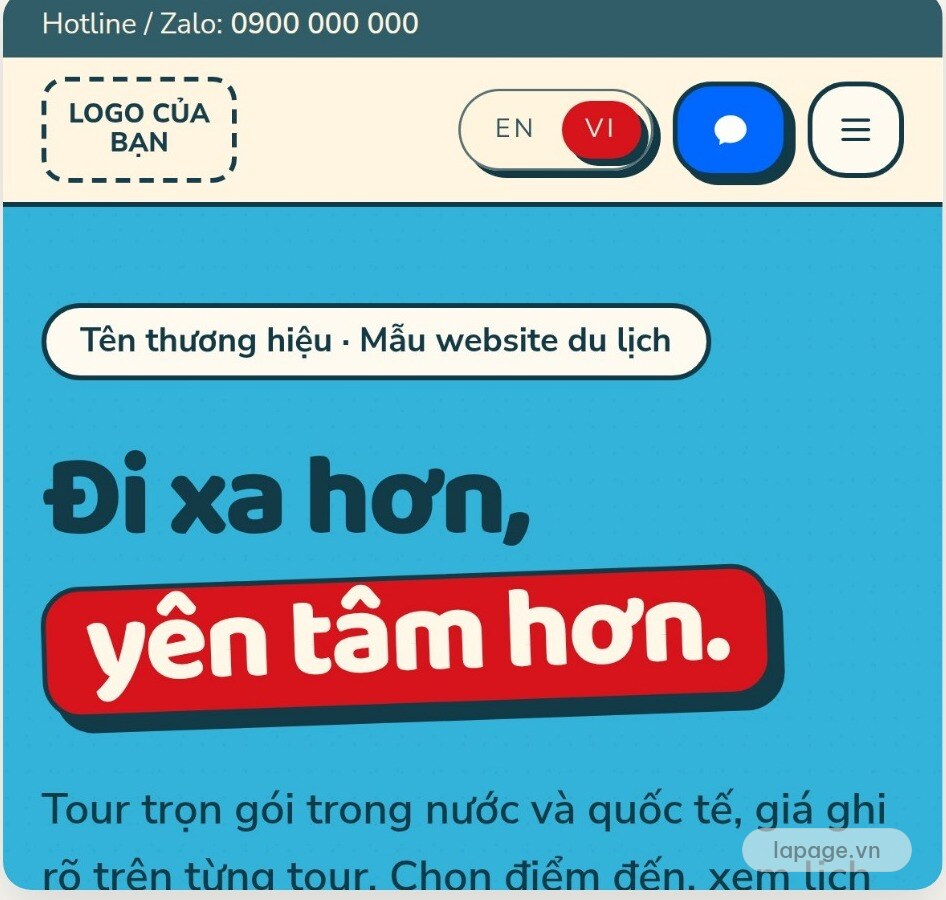
Many people browse tours on a phone, so the mobile layout has to be designed properly and not simply shrunk. Call and Zalo buttons stay within thumb reach.
Some customers only know "three days, four adults, under three million dong each". A tour assistant reads your current tours and suggests up to three, with the total cost. It is an extra, not part of the template, and it only earns its place when your list is long enough to make choosing hard.
Open your site on a phone, act like a customer, and try each row:
| Customer question | What to try | It passes when |
|---|---|---|
| What does this company sell? | Open the first screen | Clear within seconds |
| Do they go where I want? | Look for a destination | Reach a tour in two taps at most |
| When does it leave? | Look for departure dates | No need to message to find out |
| What will it cost us? | Choose the group size | An estimate appears at once |
| Who do I message? | Look for a contact button | Always visible, one tap away |
| Will staff know what I mean? | Try the booking button | The message already names the tour |
If two or more rows fail, fix the website before raising your ad budget. People may arrive, but few will message.
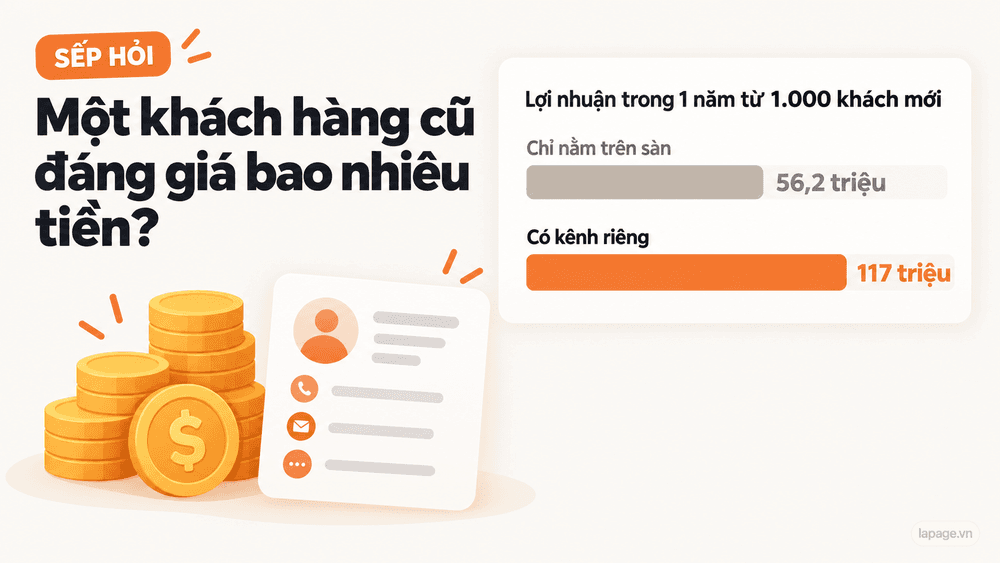
Fan pages and booking platforms bring customers, but you do not set their rules, fees or who keeps the customer list. A website on your own domain is where you arrange your tours, decide how people reach you, and keep your data. It is the asset that remains when a platform changes its algorithm or its fees.
The development fee for this tourism template is currently free. See website styles for travel and tourism or message LaPage to ask how your tours and brand would fit.
Founder of LaPage Digital, a Vietnam-based digital infrastructure and automation company founded in 2018. Huy Lan is a former Data Engineer at Publicis, where he managed data infrastructure for clients across the APMEA region. He focuses on helping businesses build reliable systems, own their data, and automate operations with practical, maintainable technology.

Subscribe to our newsletter to receive technical insights and updates on best practices for web development and hosting infrastructure.